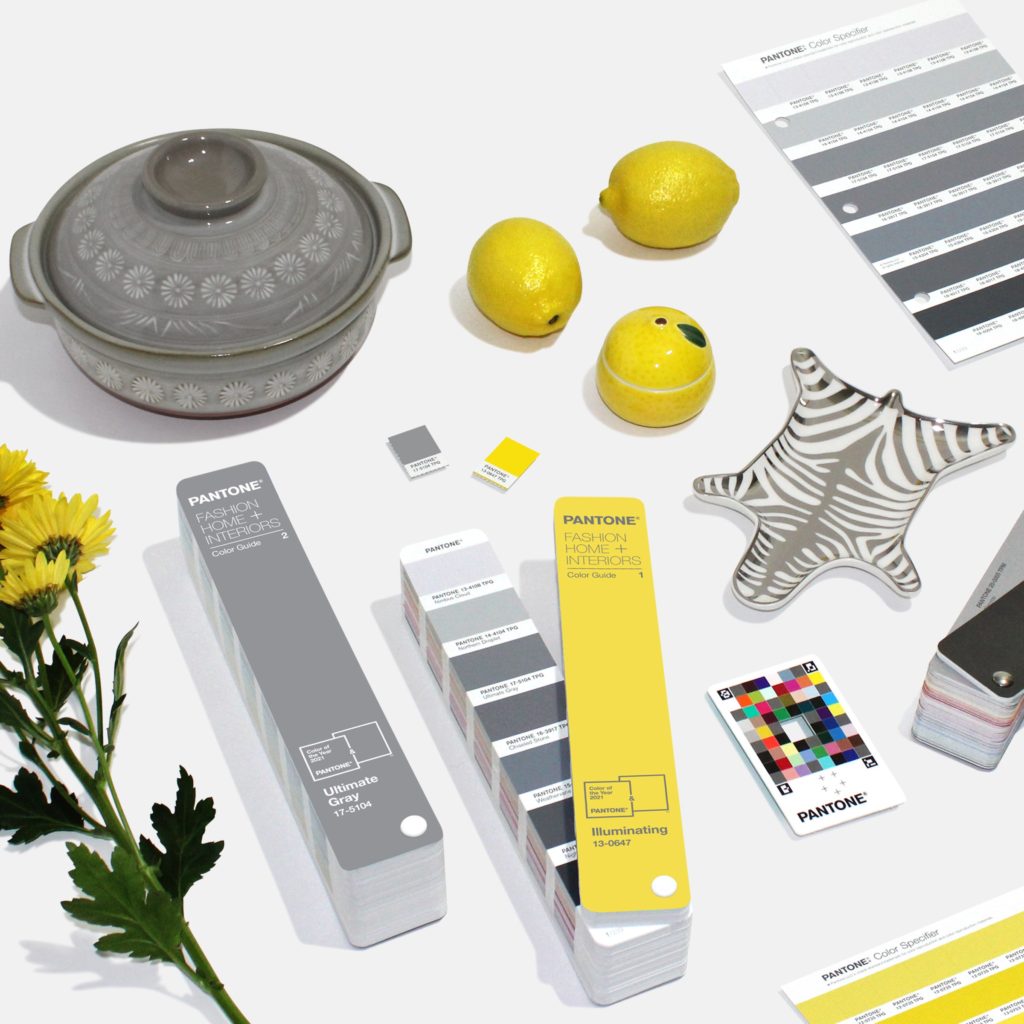
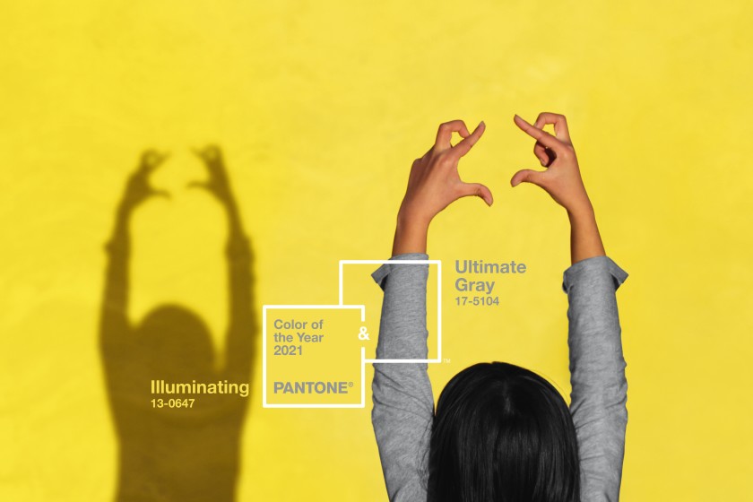
About a month ago, Pantone announced their selection for 2021. The leading organization of color forecasting presents the combination of Ultimate Gray and Illuminating as “A marriage of color conveying a message of strength and hopefulness that is both enduring and uplifting.” My gut reaction to this selection is that it feels a bit forced. I don’t recall Pantone using the Color of the Year announcement as such a blatant marketing piece. On the other hand, I don’t recall a year with as much historical significance (by textbook standards) as the year we’ve just left behind.
Now, I would be one to argue that making this decision isn’t easy by any stretch of the imagination. I can’t fathom the amount of research that is done to nail down even the final few contenders. By announcing the color of year, Pantone is essentially “taking the temperature” of the present, forecasting the near future, and translating those findings into a unique combination of C, M, Y, and K values. That’s a tall order.
The Blurred Line Between Forecasting & Relevancy
Short of mentioning it, the Pantone Color of the Year 2021 has everything to do with the COVID-19 pandemic – something that everyone, from every pocket of this planet has been dealing with. We know this because the supporting verbiage for Pantone’s selection delivers the same sentiment we have been absorbing since halfway through 2020.
“The union of an enduring Ultimate Gray with the vibrant yellow Illuminating expresses a message of positivity supported by fortitude. Practical and rock solid but at the same time warming and optimistic, this is a color combination that gives us resilience and hope. We need to feel encouraged and uplifted; this is essential to the human spirit.” – Leatrice Eiseman, Executive Director of the Pantone Color Institute
I understand that in order for a company like Pantone to declare a trend, it is in their best interest to make it feel as relevant as possible. (Although, I would argue that the right team of copywriters could sell any color as relevant during any given year). And yet, I can’t help but wonder: Would anyone have held it against Pantone if their decision wasn’t somehow linked to the ongoing health crisis and all of its turbulent outcomes?
As last year came to a close, it seemed that the only topic more relevant than the mutual dislike for 2020, was the urgency and eagerness to leave it behind. Yet, as we marched into 2021 as quickly as time would allow, we are presented with a color combination that speaks of strength and hope. The people have been strong and hopeful since the first quarter of 2020. But because companies have had the opportunity to make their public statement/homage regarding the health crisis for the better part of the year, Pantone’s December announcement feels stale, and as ARTnews writes, less of a color trend forecast and more of a metaphor that suggests the age old notion of the light at the end of a tunnel.
Illuminating is described as “imbued with solar power.” The mention of solar naturally translate to the sun. Sun = happy = yellow. Got it. Pantone’s supporting copy ties Ultimate Gray to an analogy of pebbles on a beach that have been weathered by time. Yes, we the pebbles of the world are feeling quite weathered by this storm. Oh, and rocks = strong = gray. Got it x2. After parsing through the (well-written) copywriting and boiling down the analogies, I feel as though I’m left with a rudimentary color theory lesson.
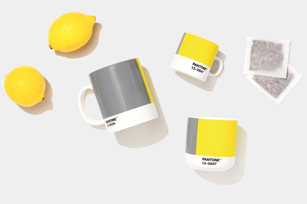
Ultimate Gray + Illuminating
When I initially came upon this announcement from Pantone, I amused myself by imagining the 2021 selection as one or the other rather than both. If Illuminating had been the solo pick for this year, I assume the pushback would be something along the lines of “overly optimistic.” It would be an untimely follow-up to a year as devastating as 2020.
Ultimate Gray selected as the solo pick for 2021 would have been sort of bleak, but certainly a bold, daring move that I could appreciate. Would the opposite feedback ring in as “overly pessimistic” or would it feel appropriate to label 2021 as a solemn epilogue to the story of 2020?
While I understand Ultimate Gray is intended to represent fortitude and resilience, I think it’s fairly mainstream to associate gray with sad, dull, depressing. If anything, I would perceive a darker tone of gray as “stronger.” But maybe that wouldn’t jive the same way with Illuminating yellow. Then we run directly into the pitfalls of selecting two colors as Color of the Year.
Somehow, selecting both Illuminating and Ultimate Gray feels safe, like it’s covering all the bases no matter how 2021 plays out. The times we’ve living in are disorienting enough, and here we are presented with not one, but two contrasting colors selected to set the tone for the year ahead.
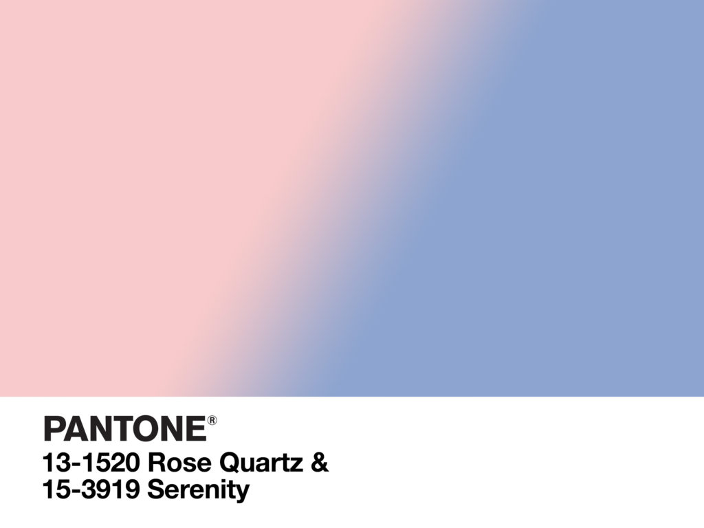
When gathering my thoughts for this piece, I took stock of 2016, the only other instance in which Pantone put two colors forward. Rose Quartz and Serenity, both delicate pastel hues, were distinctly marketed as a gradient, blending together in a way that felt natural. Only a few years later, we see the 2-color selection reappear but in a very different way.
These two colors do not blend but instead stand firmly against one another. I can’t help but feel reminded that division was a relentless theme of the year 2020 in America. Whether the subject of the division was new or far too old, an “us vs. them” mentality flourished. Much like the series of turbulent waves that crashed during 2020, this year’s Color of the Year selection is initially jarring, but ultimately predictable.