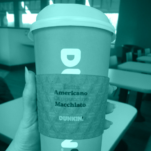
According to the Girl Scouts of the USA website, most cookie sales take place between January and April of each calendar year. With that time frame reaching a close, I wanted to take the time to evaluate the packaging that these iconic cookies are housed in before they are enjoyed (in one sitting).
It wasn’t until I approached a Girl Scout troop selling cookies in the mall that I realized the packaging received an update. Well, it turns out that the new artwork was rolled out in 2012. In my defense, between ’12-’16 I was in college and did not have much contact with any Girl Scouts. And in ’16, I began a gluten free diet and lost interest in most commercially sold cookies. Sad but true. But now that my alibi for the past seven years has been established, onto the packaging.
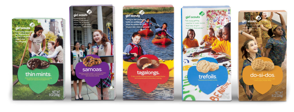
The 2012 packaging update was part of an overall rebranding that reached typefaces, type treatments, renderings, and other assets of the Girl Scouts brand. All of these components worked together to provide a look that feels modern and design-conscious. The primary call out, placed along the bottom third of each box, includes the iconic trefoil shape used as a platform for a pair of picturesque cookies, their name, and a product description. Although we’re trained to read from top to bottom, the visual weight of this element acts as an anchor, and thus, your eyes cannot help but notice this area of the package first. The strict all-lowercase type treatment for the brand and product name appears contemporary and particularly appropriate for a fleet of goodies that have become so reputable, they don’t need to make much noise in order to generate sales.
Seriously – once they have their table set up, Girl Scouts have the option of quietly waiting for the customers to approach them. Because unlike almost any other group that participates in tabling to sell goods or services, the customers already know what’s being sold and they won’t need any persuading.
So, yes, no uppercase emphasis needed here. Also, the lowercase letters fit more comfortably between the product images and the copy; whereas even an initial caps treatment may cause spacing issues in that tight area. Not to mention this typeface reads as youthful and trustworthy, especially used in lowercase.
While GSUSA has the selling advantage of a long-standing, deliciously sweet relationship with the general public, they are expected to market themselves in a way that greatly differs from that of Nabisco’s Oreo cookies, for example. These cookies are not just a snack, they are a fiscal means of supporting an organization that has been supporting girls and young women since 1912. Ultimately, they are Girl Scouts of the USA first, and cookie sellers second. This is something the organization is more or less expected to clarify through their packaging.
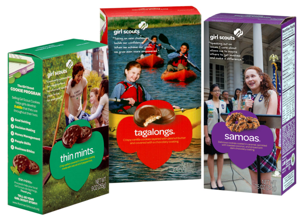
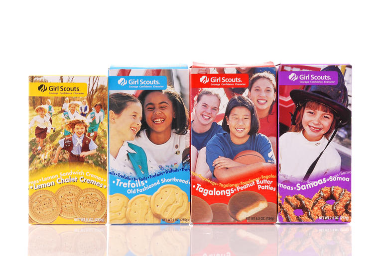
With that in mind, GSUSA is tasked with flooding the entire front panel of their packaging with photography. These carefully selected photographs had to fill a quota that I predict followed something like this: 1. Are the girls doing things that in some way, embrace the ideology of GSUSA? Check. (The old imagery was pleasant but in comparison, doesn’t provide very much context and in turn, feels stock photo-esque. The photography was dating the box and while there is a certain charm to that, I can understand why consumers may not love the idea of eating from a box that appears outdated). 2. Are these images as timeless as possible? Check. The Girl Scouts featured on the packaging are dressed generically and are participating in general activities. Eventually, the images will appear outdated just as the previous collection did. But if the goal is to maintain relevancy for as long as possible, these images are promising. 3. When broken up by the trefoil graphic, do the photographs maintain fluidity? Mostly check.

The images flow seamlessly around the large trefoil graphic, with the exception of the image used for the Thin Mints box. For being the number one seller, I am underwhelmed by the way this image appears. While it doesn’t take very long to gather than the woman and girls are participating in a gardening activity, it feels like something here is visually “missing” that would help tie it all together. The trefoil is covering nearly all of the wheelbarrow along with whatever is in it. All three of the subjects in the photo are physically engaging with the same thing, and it is essentially being hidden – it’s visually awkward. In that same vein, I am distracted by the long handle of the shovel. Regardless of being an appropriate gardening prop, the shovel gets broken up by the trefoil so all I can focus on is this long piece of wood sort of floating in space. It also runs though the quote in the upper left, which adds to its intrusive presence. It wouldn’t have been too difficult to clone out of the image. I imagine something smaller and more compact, like a watering can sitting in grass would have worked better. Assuming that Thin Mint boxes end up in consumer hands more than any other box, I just wonder if this one was scrutinized enough?
The new cookie images look very delicious, plain and simple. It’s difficult to tell whether they are high resolution photos or renderings and their placement at the top of the trefoil shape is a good fit, but I have to say that I miss the movement of the cookies and text at the bottom of the previous packaging.
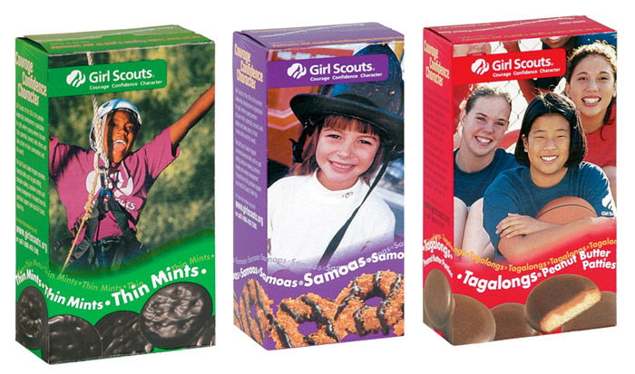
The wavy treatment of repeating text accompanied by cookies dancing along the bottom of the box was a hallmark feature of Girl Scout cookie packaging. The multiple lines of bouncing text are reminiscent of all the buzz that surrounds Girl Scout cookie sales every year. They are a visual representation of how, without fail, people will be talking about them with enthusiasm throughout the selling season. Previously, the cookie imagery was used as an actual design element, bleeding off the front panel on three sides whereas now, the imagery is used in more solidarity, similar to that of a Girl Scout badge. The playful feel of the repeating text and cookie arrangements were so very unique to the GSUSA packaging; I struggle to recall other brands or products that use a similar look, and for that reason, I am sad to see that element of the package go into retirement.
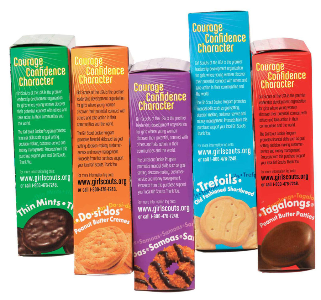
The left panel of the box was updated from a couple paragraphs of text (that were likely too long for most consumers to read) and a call to action. This side of the box is now utilized to identify the pillars of the Girl Scout cookie program in a listed format. These quick blurbs of text are much more likely to grab and hold attention. Again, I prefer the look of the cookies dancing off the edges of the panel rather than the cookie “badges” centered ever-so-perfectly on that narrow side of the box. Also, the notebook/pencil graphic at the top comes off as filler to me, and sort of forces all the other information downward. Without a strong argument to keep the notebook graphic, I would remove it and increase the size of the headline text, creating a more spacious layout.
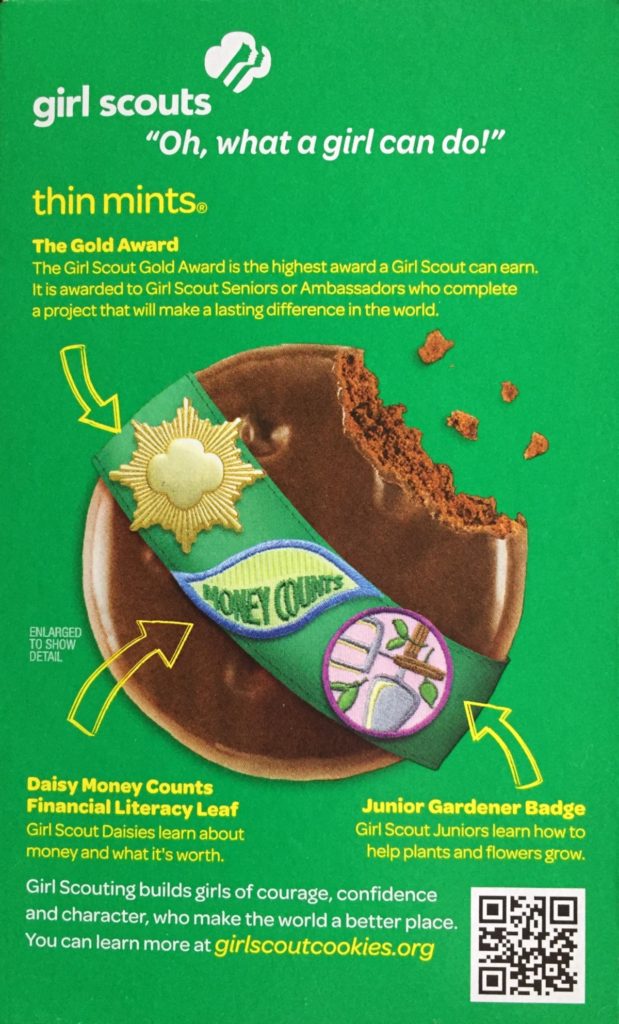
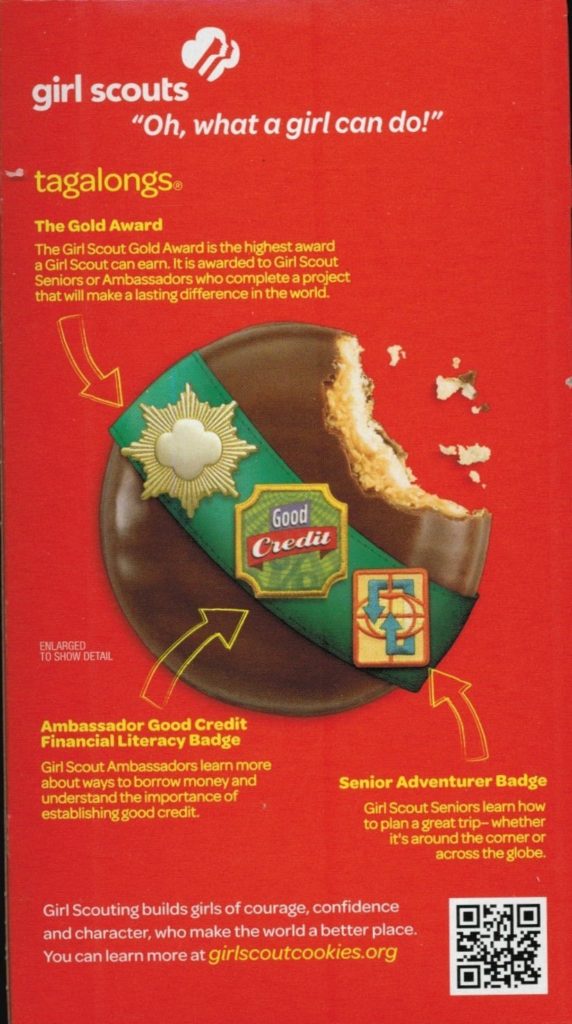
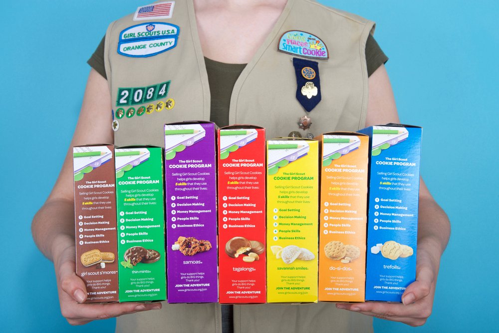
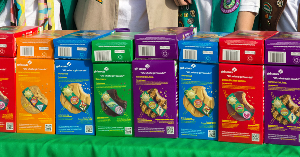
My favorite part of the package redesign: cookies wearing a sash! It’s simple, clever, and eye-catching. I’ve scoured the internet trying to find the previous back panel artwork but I’m starting to think that maybe it was the front panel artwork repeated onto the back? Anyway, the cookie donning a sash is cute and I think it’s something that would make children smile. The playful imagery also doubles as an infographic, which have been quite popular for some time now. These graphics shed some light on the badges that we all know Girl Scouts collect, but not necessarily what they look like or represent. Each badge is like a little piece of artwork, making this a great way to customize each box in a way other than cookie images. I couldn’t help but think to myself: If I were selling cookies with my troop, I would want to turn the boxes around to have this panel facing the customers. It seems like some troops have been there done that according to the below photo I found online. If the back of the box is being used to promote the product, I guess that could mean one of two things: The boxes have been designed with versatility, allowing them to effectively sell from either side or the back panel simply does a better job of pulling customers in and promoting the products. I can’t help but feel like it’s “nonprofit organization” on the front and “cookie company” on the back. Which I suppose is good because to the American public, GSUSA is sort of both, right?
All things considered, the 2012 packaging update was a good one. During my research, I did find some push back that generally fell into the realm of “Why fix what isn’t broken?” But, there were elements of the previous design that were stale. GSUSA isn’t a ma & pa business- If it has the means of doing consumer research and hiring an agency to make changes, why not? My only real criticism of the new packaging is the lack of movement and energy. All the elements are pretty static and linear, which gives me a more serious, “grown-up” feel.
So that’s that. The bakers will keep baking, the Girl Scouts will keep selling, and I’ll try to avoid reviewing a package update 7 years after the fact. Ta-da!