Within merely a month of each other, fast food giants Burger King and McDonald’s unveil updates to their visual identities. In January, BK publicly launched the new direction of their entire visual portfolio. There’s a lot to unpack with this brand overhaul. But amongst the “newness” and eagerness to explore it all, there is one outlier. Burger King opted for a familiar friend: their logo concept dating back to 1969.
And just days ago, the public catches wind of a new packaging rollout from McDonalds’ side of the street. I say “side of the street” because the McDonald’s and Burger King restaurants that I visited growing up were located directly across the street from one another (and still are to this day). So, there isn’t much question as to why I imagine these two establishments in such a way: physically facing off with one another, always watching and observing in such close proximity that no move is too small to go unnoticed by the competition.
BK Logo: Oldie But A Goodie
Image/Caption credit: dezeen.com
That’s right – Burger King has done something that I would consider incredibly atypical for most companies, especially those of such prominence. I’m a fan of this decision for a few reasons:
- This decision signals honesty. I think we, as people, are becoming more and more obsessed with the idea of making progress and having something to show for it. The BK team boldly resisted the temptation of designing an entirely new logo, challenged the institution of new=better, and chose to revisit a previous concept.
- By taking this “step back,” BK has successfully (and painlessly) simplified their logo. How many companies could actually replicate this move? Look at the logo history of major brands like Apple, Nike, or Google – without fail, the logo is simplified with each version. In hindsight, the ’69-’94 logo was ahead of it’s time.
- Plain and simple, this logo is visually very satisfying. I’m a sucker for rounded edges here, there, everywhere. The text fits so comfortably between the buns, with just the right amount of breathing room between elements. The design team working on this truly optimized the former logo to its full potential.
“We explored a lot of different design territories, but kept coming back to the brand’s original iconic logo from 1969 and 1994 when Burger King looked at its best,” – Lisa Smith, Executive Creative Director at Jones Knowles Ritchie
BK Bids Farewell to Blue
The changes to Burger King’s brand identity go beyond an aesthetic update adhering to the popularity of flat, stylized illustration. Through this visual overhaul, the BK team aims to communicate changes that have been made to the quality and nature of their products, while emphasizing the characteristics that have made them a beloved fast food chain for decades. Taken from the words of their new promo video (below), BK wants to “look how they taste.”
The logo that’s been replaced has been representing BK for 20 years – that’s quite a bit of time. As someone born in ’94, that’s essentially the only mark I have come to associate with the fast food chain. The decision to not only use a previous logo, but forego the blue altogether adds to the thoughtfulness of this rebrand. It’s simple: in the world of food and nutrition, blue doesn’t read as “natural.”
“Our choice to remove the color blue was somewhat symbolic of Burger King’s recent removal of colors, flavors, and preservatives from artificial sources,” – Lisa Smith, Executive Creative Director at Jones Knowles Ritchie
I can totally get behind that explanation. Personally, when I think of blue in terms of food, my mind goes to ‘Blue Raspberry,’ a go-to for candy, slushies, and sugary cocktails. Sure, there are blueberries. But the bright blue that BK has been repping for the past two decades doesn’t exactly read as “sourced from nature.” Whether consumers realize it or not, they take color cues from eateries and use those cues to form judgments on the food that’s being offered.
Would You Like Your Fast Food Groovin’ or Barely Movin’?
As described by HYPEBEAST, the Burger King transformation is truly a top-to-bottom rebrand. The design team at Jones Knowles Ritchie did not miss a beat, addressing everything from the logo to employee uniforms. It makes you stop to think about all the branding “real estate” that needs attention when you’re dealing with a fast food chain.
From the color palette, type choice, and stylized illustrations, it’s quickly established that the strategy is retro. For an establishment that opened its doors in 1954, it’s as if BK is paying tribute to humble beginnings while simultaneously celebrating their success with a “best that money can buy” rebrand. I can’t help but look at this project and think, “Wow this looks expensive.” It’s so polished.
I’m absolutely wowed by the promotional video for BK’s new visual identity. Every decision appears so carefully crafted, making for a truly comprehensive look and feel. There is an obvious confidence in the way this video is executed that reads as “this is great and we know it.” I could go on and on, but instead, I’ll focus on the contrast between this and McDonald’s latest design ventures.
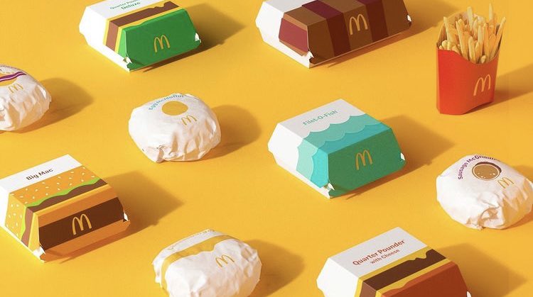
Design studio Pearlfisher took on the task of redesigning the full spectrum of packaging for McDonald’s menu items. Right away, I took note of the fact that while Jones Knowles Ritchie has done work for other fast food chains like Dunkin’ and Baskin Robbins, Pearlfisher’s portfolio of work doesn’t include any other companies within the fast food industry. There’s something to be said about choosing to work with a team that has fast food experience or one that does not. You’re either looking for a team that has expertise within the space or one that’s been successful in other spaces, offering the potential of a completely fresh approach.

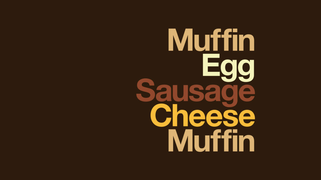
Team McDonald’s went with incredibly minimal illustrations that represent each menu item. The flat graphic style goes as far as using a singular yellow circle to represent an Egg McMuffin. This system reminds me of a map legend – using simple shapes and symbols to quickly identify subjects that are more complex. It’s interesting to see where the team landed in terms of capturing these iconic menu items using the simplest means of shapes and colors.
“There’s beauty in the simplicity of McDonald’s’ iconic menu items. We aimed to find the most special, recognizable and iconic expression of each—celebrating them in a way that makes people smile.” – Matt Sia, Creative Director at Pearlfisher
Most interesting of all, is to see how two companies with similar ideals, menus, and consumers have opted for such opposing visual directions. BK drives home the idea of playfulness and movement through their type treatment and illustration, while McDonald’s takes a stance that feels deliberately fixed, stagnant. I find McDonald’s strategy to be interesting, but not nearly as exciting as the visuals put forth by Burger King.
But that doesn’t mean I can’t appreciate what McDonald’s is doing here. I interpret this move as McDonald’s stating “We’re the default, the standard, when it comes to fast food.” And I can’t really dispute that. If I were asked to name fast food chains, I’m certain the first one I would name is McDonald’s. Pearlfisher is visually communicating that McDonald’s is the Helvetica of fast food restaurants.
Considering this Helvetica-centric campaign executed by Leo Burnett last year, the fast food chain has been heading this direction for some time. McDonald’s is so sure of its industry dominance, they are willing to flirt with a utilitarian brand identity. I would argue that there are pros and cons to whittling your visuals down to the absolute bare minimum. But let’s be honest: When you’re an industry leader like McDonald’s, not only are you afforded certain opportunities that may not otherwise present themselves, but the risk-taking doesn’t feel quite as risky.