Toward the tail end of 2020, San Diego-based company, Petco, announced an identity change. What began as a declaration to cease the sale of shock collars, was promptly followed by an announcement regarding a change to the company’s full name and visual identity. The official title will be changing from “Petco Animal Supplies, Inc.” to “Petco, The Health and Wellness Company.”
“We’re transitioning from being a company that asks, ‘Can I help you put that big bag of dog food into your cart?’ into a full health and wellness company,” – Ron Coughlin, Petco CEO
It’s no secret that, particularly in the American market, the perception of pets has greatly evolved within the last few decades. You get supplies for a new school year, a 2-week vacation, a birthday party, perhaps your new at-home office. But gone are the days where pets are something we simply “get supplies for.” With this rebrand, Petco is pledging to share that same sentiment.
I would imagine that this era of pet ownership feels like a make-or-break moment for Petco. As a company that opened its doors in 1965 (a solid 20 years before major competitor PetSmart), it’s must be exciting to learn that your industry is on a gloriously booming trajectory – and you didn’t even need to stretch your marketing budget to get it there.
In other words, the steady increase in pet ownership/caretaking happened completely outside your sphere of influence. But, it’s happening nonetheless, you happen to be a household name for pet owners, and you’re already operating approximately 1,500 locations for doting pet owners to flock to on a regular basis. Hooray!
Talk about a stroke of good fortune…until, that is, you realize that your services, offerings, and/or mission statement no longer align with the revamped standards of your target audience. Competitors new to the space, such as Chewy, Inc, arrive on the scene circa 2011 and they’ve done their homework. Whether it’s the wide range of organic food options, educational videos, condolence cards, or prompt delivery service, Chewy has successfully painted the picture that they care about your pet just as much as you do.
It only takes a few years of that before your OG status in the pet space starts to feel like a blemish that reads as “old-fashioned, traditionalist, out of touch,” and other millennial insults.
So finally, after a pandemic year that induced massive amounts of pet adoption (myself included) and spending, Petco announces the big one.
Pets, Babies – What’s the Difference?
According to Zoom Room, millennials now represent the most significant demographic in the pet industry. There have been countless reports on how millennials, on average, are choosing to start a family later in life compared to their Baby Boomer parents. Fur babies are the exception to this pattern, trend, movement, whatever you’d label it. Like any parent who wants the best for their child’s wellbeing, pet parents have been looking to the pet industry for higher standards of health and wellness.
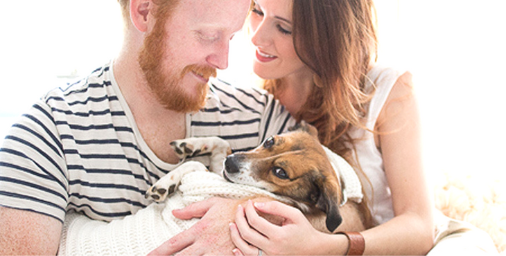
According to a Purdue University study, more than half of pet owners believe that “humans have an obligation to provide the best standard of care for dogs that they are capable of.”
I find this to be an extraordinary example of consumer lifestyles and values inadvertently dictating the moves of industry leaders.
The Health + Wellness Co.
The verbiage of Petco’s new full name comes from a place I can certainly understand. It’s simple and straightforward. Whether it’s a tech gadget that captures your vitals, the latest CBD brand, or an influencer promoting the softest workout pants, it seems like everyone is talking about health and wellness in one sense or another.
The only part that trips me up a little bit: While I know that Petco is its own distinct brand “word,” there’s no way to really distinguish it in a spoken manner from “Pet Co.” I’ve always thought of the “co” part of Petco as “Company.” The sheer simplicity of the name has always reinforced the idea that Petco is one of the original players in the industry.
But in order for the new name to make sense, I’ll have to disassociate “co” as company or else I’ll be reading “Pet Company, The Health and Wellness Company.”
The Dismantled Combination Mark
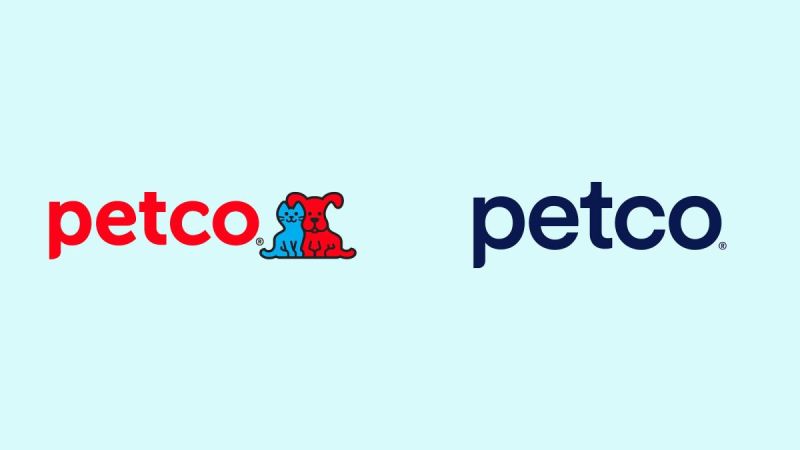
Well, it’s high time to address the most notable change to Petco’s rebranding: the removal of Ruff and Mews from the well known combination mark. As a lover of all things cute and cuddly, maybe I’m biased in saying this but – what a loss! I didn’t even know they had names until researching the rebrand – that of course, adds to the sadness. Where along the line in a series of discussions was it decided that Ruff & Mews were to blame for any of Petco’s shortcomings?
If this had anything to do with the animals appearing too cute, playful, childish, etc, let’s stop right there! Have we already forgotten that the pet industry boom is owed, in part, to the fact that pets are our now considered our honorary children? Would a childish association really be the worst thing? All pet owners are committed to the idea that their pet is the cutest pet. The internet isn’t overflowing with pet photos just because. All I’m saying is that the cat/dog duo is already beloved, and Petco passed up the opportunity to rebrand them as “America’s Furbabies.”
I like to think that competitors deliberately avoided incorporating animals with their logos because Petco had claimed that simple, enviable territory. What an ironic twist – the pet store brand attempting to rebrand itself as more of a caretaker than a supplier decidedly removes the happy, cuddly animals from its most identifying feature.
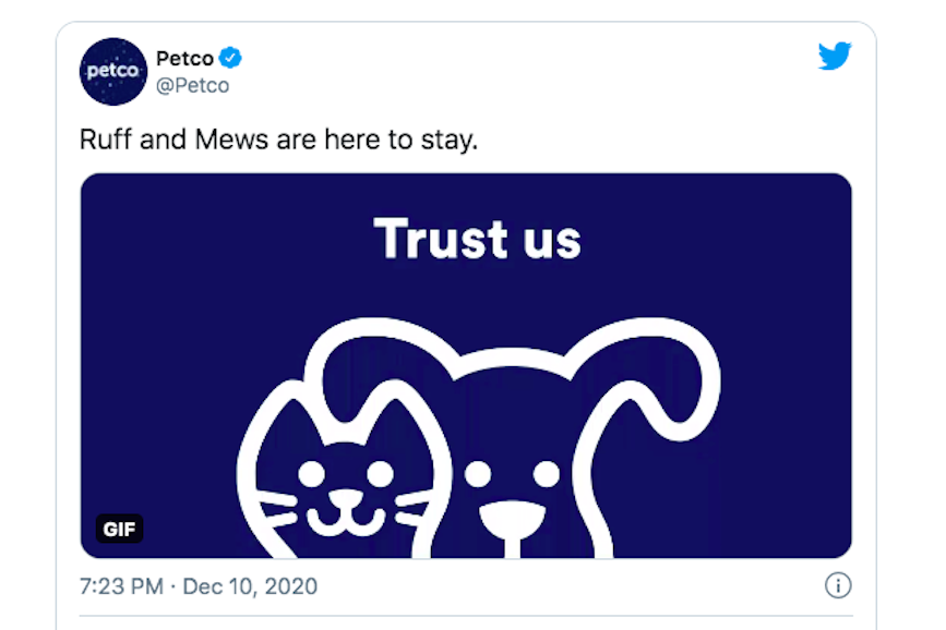
Petco has attempted to reassure disgruntled Twitter users that the cuddly duo have not been entirely removed from the brand identity. They have succeeded in creating an interpretation of Ruff and Mews (white outline and transparent fill) that are essentially ghosts of their former selves.
And it isn’t just forlorn pet owners and everyday consumers speaking out: the design community has plenty to say regarding the removal of Petco’s longtime furry friends and its misguided attempt of modernizing.
“I’m not snarking the people who created this logo: they had a job to do & wanted to make the client — who wanted a contemporary logo — happy. More honestly — maybe I & my colleagues in academia are to blame the most. What are we teaching that leads to this? Original thought? Insightful research? Interdisciplinary empathy? Or are we teaching ‘reflect on what people think is cool & then do versions of that kind of?’ – Mitch Goldstein, Associate Professor at RIT College of Art & Design
Two Colors Become One
Of all the adjustments that were made in the name of this rebrand, the only change that I could rally behind is a change to Petco’s previous color palette. The red and blue colors were so close to what I would consider primary colors that they came off as dated – as if they were settled on during a time where the print production color spectrum was far more limited than it is today.
When pet owners think health & wellness for their animals, I assume that the daily feeding regime is top of mind. These consumers are seeking out the cleanest, most natural and organic food options. The bright red and blue tones feel less like they’re coming from the food aisle, and more like they’ve been pulled from the other side of the store, in the squeaky chew toy section.
The red and blue are pleasant in their simplicity but with Petco attempting to rebrand themselves as more health-oriented, I think a reassessment of the color palette was in order. I would have preferred to see them stick with a two-color identity as that was very synonymous with the Petco brand, suggesting the diverse spectrum of animals that frequent their stores. The removal of the pet pals was drastic enough, so stripping the color palette from two to one doesn’t leave much as far as personality goes.
Closing Thoughts
The flat, minimalist trends that have been dominating design for a number of years certainly do have benefits and visual appeal. I love and appreciate a deliberately simple logo. But it seems that some companies, like Petco, are under the assumption that if you want to be taken seriously, your branding should be as simple as possible – as if simplicity irrefutably exudes the most confidence.
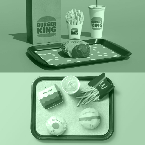
It’s disheartening to see a brand as well known as Petco opt for a rebrand that makes them look as if they just hopped on the scene. It’s one thing do a brand “refresh” or even take a 20-year step backward like Burger King recently did, but this feels more like brand abandonment.
While writing this entry, I was reminded of a brief conversation I had with my Italian grandmother, “Nonna,” in which she shared her experience with pets. While growing up in the mountain village of Cervinara, not far from Naples, her household had several cats. The human-to-cat dynamic was made clear: The cats had shelter and food, so long as that food was the mice that inevitably made their way inside. In turn, my Nonna and her family had a mouse-free home.
With that in mind, I think about the waves of change that have brought Petco to this point of rebranding themselves as a health and wellness company. And well, there has never been a better time to be a pet!