Since starting my full time job, I’ve developed an amateur caffeine dependency (1-2 cups a day). My workplace provides free coffee with all sorts of fixings, but on the weekends I have to fend for myself. And that is how I found myself visiting a local Dunkin’ Donuts with what I believed to be a ‘caffeine withdrawl’ headache. So there I am sipping my Girl Scout’s Thin Mints® latte, when it suddenly occurs to me: Hey! They actually did drop the ‘Donuts’ from their brand name. Hmph.
I took note of the fact that the rebrand didn’t occur to me immediately. The employee handed me an orange cup with a brown sleeve, which didn’t seem out of place. As I gave it some more thought, I’d like to assume that the redesign is meant to introduce itself with subtlety. Although the decision to drop ‘Donuts’ feels a little drastic, the identity feels familiar. It’s as if small town Dunkin’ Donuts went off to college in the big city, ditched the longtime baggage of years past and returned home as Dunkin’, a more stylishly calculated version of itself.
Side note: I would have loved to have been a sprinkle on the doughnut when that first person at Dunkin’ Donuts headquarters offered up the idea of removing ‘Donuts’ from the brand name. How many heated debates were centered around this? Working in the consumer goods industry and closely with packaging, I have come to terms with the idea that when it comes to debating, nothing is off the table. Once every last detail of a package has been debated, everyone has a much better idea of what that product stands for.
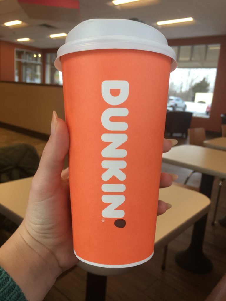
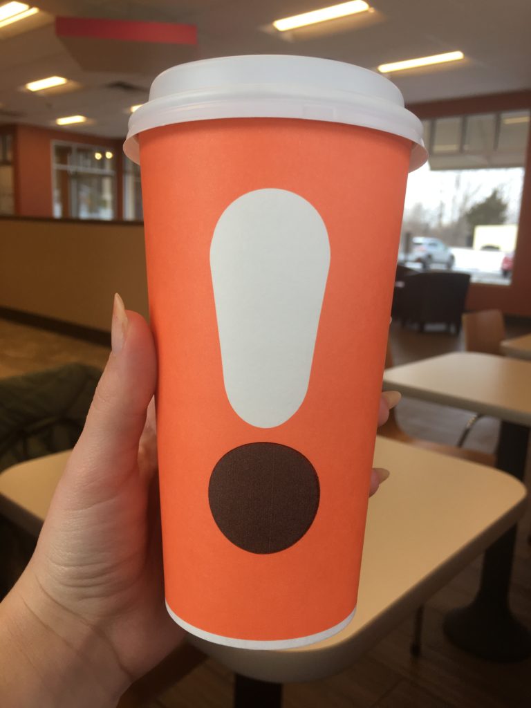

First and foremost, I am an absolute sucker for chunky, rounded typefaces like the Frankfurter typeface that Dunkin’ is known for. It looks full and content. I truly enjoy looking at it. And I certainly admire the treatment of ‘Dunkin’ running vertically down the cup in tandem with the equally chunky exclamation point on the opposite side of the cup. From what I understand, the exclamation point is representative of the espresso-based beverages. Energized punctuation for an energized drink, can’t argue with that. While researching I saw an image that displayed a few different variations of the exclamation point that are used to represent a specific espresso drink. Each exclamation point is broken into different section of white, light brown, and dark brown to indicate varying levels of milk, foam, espresso, etc. I certainly admire the idea of customizing the cup to the drink, but that has the potential for a few logistical setbacks.
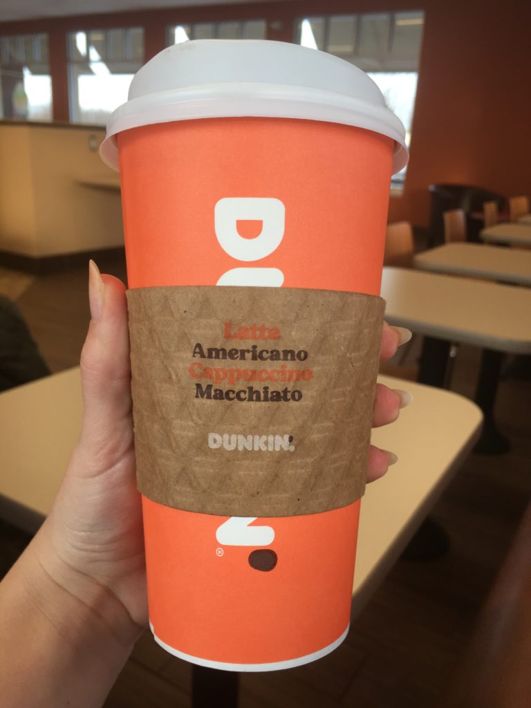
The brown sleeve is a nice touch. I’m not so sure if it’s really there to protect hands from the heat or mainly an aesthetic feature. Not only does it break up all that orange quite nicely, but its presence comes off as an attempt to dissolve a corporate look, which I can appreciate. I wouldn’t consider it Dunkin’ trying to pretend to be something its not, but instead, they believe their coffee is just as good as that small local shop. And with that good faith, they will present it just so. However, I predict that the sleeves will change over the course of the next year or so, once all the hubub has died down. The stock has a triangle motif stamped into it and they are printing 3 different colors on it! That seems like a fairly pricey feature if you ask me.
The typeface used on the sleeve is Dunkin’ Sans, a new typeface that was created for this launch based on a typeface that was used on Dunkin’ Donuts advertisements back in the day. I do admire that nostalgic touch, but I feel a little disconnected, and I can’t help but wonder if this will grow to become a typeface that consumers associate with Dunkin’. It’s a middle of the road typeface that I struggle to categorize and assign a particular feel to.

The design includes an updated layout for the add-ons, the area of the cup where the employee is able to differentiate your order from others. Before, this area was just a single list running down the side accompanied by oblong ovals for creating any sort of mark. The updated design employs a grid system that arranges each option in a sort of hierarchy based on the sequence in which a customer tends to order. When ordering, I’m sure that customers tend to name the flavor before getting into specific creams and sugars. The grid seems a bit more methodical and important than a list. One question that struck me when I first saw this: When employees do actually mark the cup, how are they instructed to approach this new grid? Circle? Checkmark? It just looks so complete and without any designated areas for marking, I wonder how employees have been instructed to mark this dainty, carefully calculated grid.
Side note: I read that the design team created the Frankfurter alphabet in lowercase because it only existed as uppercase. Game changer! It’s interesting to think that the brand has not used that iconic typeface in lowercase until now. The title caps treatment used in the add-ons grid seems appropriate. If the text was all uppercase, not only would it require more space, but it would overstate an element that promotes levelheadedness and control.
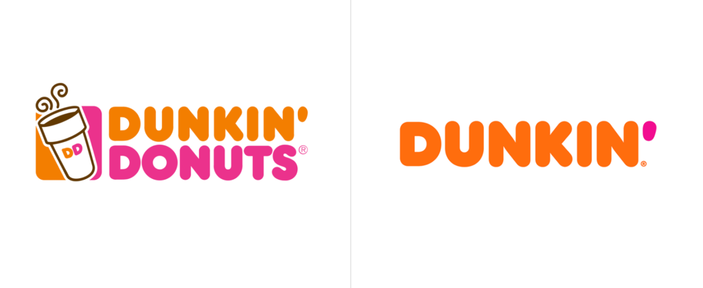
Last but certainly not least, the brand colors. From what I can tell, both the orange and pink are a little warmer, but the orange more so. When comparing one to the next, I personally prefer the previous orange tone. However, I assume that the warmer orange plays nicer with the deep brown color. What I am struggling to look past is that the new orange has ‘pumpkin’ written all over it. With the orange and brown combined, I get a very seasonal (Autumn) vibe. During the autumn months, when the marketing rollout was in full swing, I drove by a billboard on my way to work every morning. The color scheme of orange, brown and white in conjunction with the Dunkin’ Sans typeface presented such a Halloween/Thanksgiving feel. I couldn’t quite decide if it was a seasonal promotion or the real deal.
All in all, this rebrand was executed tastefully. A good rebrand never made anyone grumpy, but a lack of coffee sure does!
A very intriguing take on the rebrand! I have to say I find myself liking the warmer orange more. The old orange in comparison seems “dusty” to me especially when analyzing its contrast with its saturated pink counterpart. On the other hand, I cannot argue that it does rub off as a fall seasonal palette, especially when considering how they have seemingly removed pink as a equally participating color to their brand. However, my brand loyalty to Starbucks could play factor into how observant I am of Dunkin’s advertising efforts and consistency among their color choices.
I get a really 70’s/vintage vibe from Dunkin’. Brown with orange and pink screams this era to me. 🙂